You added to cart:


SEO Marketing - Consultancy
1 x $22


We connect your website to Google Analytics and Google Search Console to keep track of all your site traffic and key metrics in real-time.

Here’s a cool comparison between browsing websites on desktop and mobile devices, and it’s a bit of an eye-opener.
We have developed over 50 websites in Tanzania for clients around the world. From our experience over 70% of all our client’s websites are now viewed on mobile devices.
This is backed up by these worldwide statistics (Sources: StatCounter, DataReportal, DataReportal (2) )
 Over 55% of website traffic comes from mobile devices.
As of November 2023, people using mobile devices contribute to 56.2% of all website traffic.
Back in 2011, this figure sat at less than one-third (6.1%). In 2015, this was up to 37.2%.
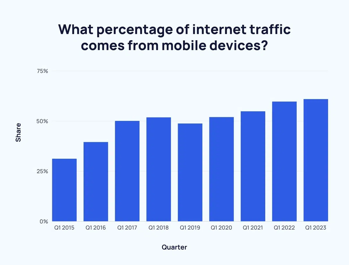
The percentage of people accessing the internet via mobile devices has increased quarter-over-quarter. Q1 2017 was the first time mobile traffic surpassed traffic from desktop computers.
Let me say that again; Over 55% of website traffic comes from mobile devices. 92.3% of internet users access the internet using a mobile phone. There are approximately 4.32 billion active mobile internet users.
Nowadays, we all use the internet on different devices, so it’s super important that websites are user-friendly on both platforms. Did you know that user behavior on mobile and desktops is completely different? That’s why businesses should optimize their websites for different devices and contexts. And here’s a fun fact: optimizing for mobile can actually improve your website’s ranking on Google!
But it’s not just about SEO – you want your website to be easy to navigate, with legible font sizes and appropriate spacing between elements. If you’re running an e-commerce site, it’s also essential to have a mobile-friendly checkout to succeed. Overall, this post is a great resource for anyone who wants to improve their website’s user-friendliness!


Google, for example, considers mobile-friendliness as a ranking factor. Google will prioritise websites that are optimised for mobile devices in mobile search results. Such mobile-friendly websites are designed for fast loading and easy small-screen navigation.
In addition, page speed is a ranking factor for both desktop and mobile searches, but it holds greater importance for mobile searches.
As mentioned, mobile users often have slower internet connections, so websites that load quickly on mobile devices are more likely to rank higher in mobile search results.
Ultimately, user experience is a critical aspect of SEO, and device usage plays a pivotal role in shaping it. Since the user experience differs between mobile and desktop devices, it is essential to optimise your website for both to achieve higher rankings and maximise visibility.
To check your website loading and optimisation speeds use this free PageSpeed Insights an online tool from Google .
If you need guidance on understanding your website’s SEO, or just want to see how it ranks comapared with your competitors, explore our free SEO Audit Report offer.


As you can see, there are many benefits of having a fast and mobile-friendly website, both for your business and your customers. However, improving website load speed is not an easy task, as it requires careful planning and execution. You need to consider factors such as the size of your content, the structure design and functionality of your website, and the best speed caching tools to utilize.
That’s where we can help. At Simply IT Zanzibar, we are experts in mobile website responsiveness. We can help you with every aspect of your website from hosting on speedy cloud servers, to implementing SEO structure and Google’s recommended page load good practices. We have the experience, skills, and resources to make your website project a complete success.
Thank you for reading our blog post, and we hope to hear from you soon.
We are the Digital Marketing Agency of choice for over 50 happy clients in Zanzibar, Tanzania, East Africa, Asia and Europe.

Choosing the right website design agency in Zanzibar for your business can be confusing or difficult. The island is filling up with web developers, then there is Tanzania and East Africa! Help is on hand…

Any size business needs an online presence, so creating a website is a great way to build your brand, connect with clients both old and new, and expand your organization’s potential.
There is plenty that may be done to succeed, whether you need a promotional website or an eCommerce platform; yet, having a website alone won’t guarantee success.
What Not to Do…

This is a common mantra we hear a lot in Zanzibar and Tanzania; “A website is not important anymore…Social Media is more important now


 English
  Swahili
  Amharic
  Danish
  Dutch
Dutch  French
  German
  Italian
  Polish
  Arabic